.svg)

We designed peer-to-peer interactions to make lending items among a network of trusted people feel rewarding and appreciated.
JUMP TO FINAL PROTOTYPE
TEAM
Tammy Hu
Jency Clements
Emma Sadjo
Jency Clements
Emma Sadjo
DURATION
6 months
TOOls
Figma
FigJam
Miro
FigJam
Miro
MY ROLE
UI/UX Designer
UX Researcher
Prototyping (Figma)
UX Researcher
Prototyping (Figma)
ANGELA LIU

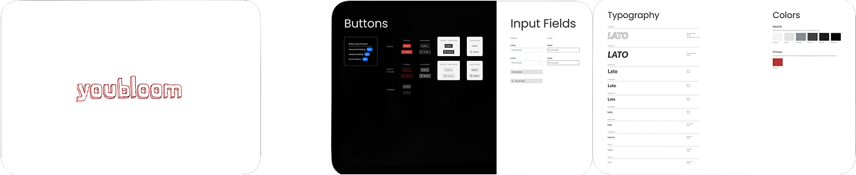
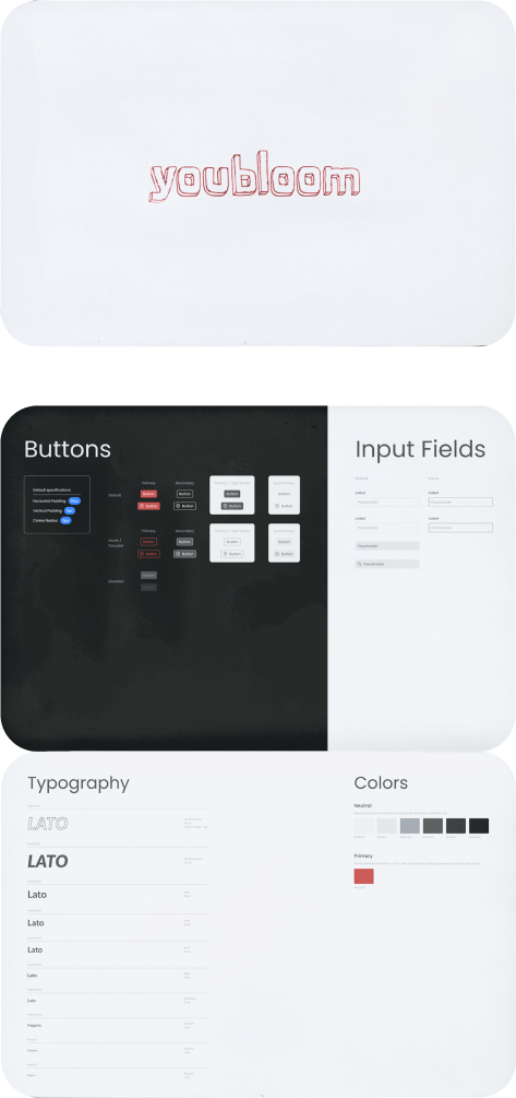
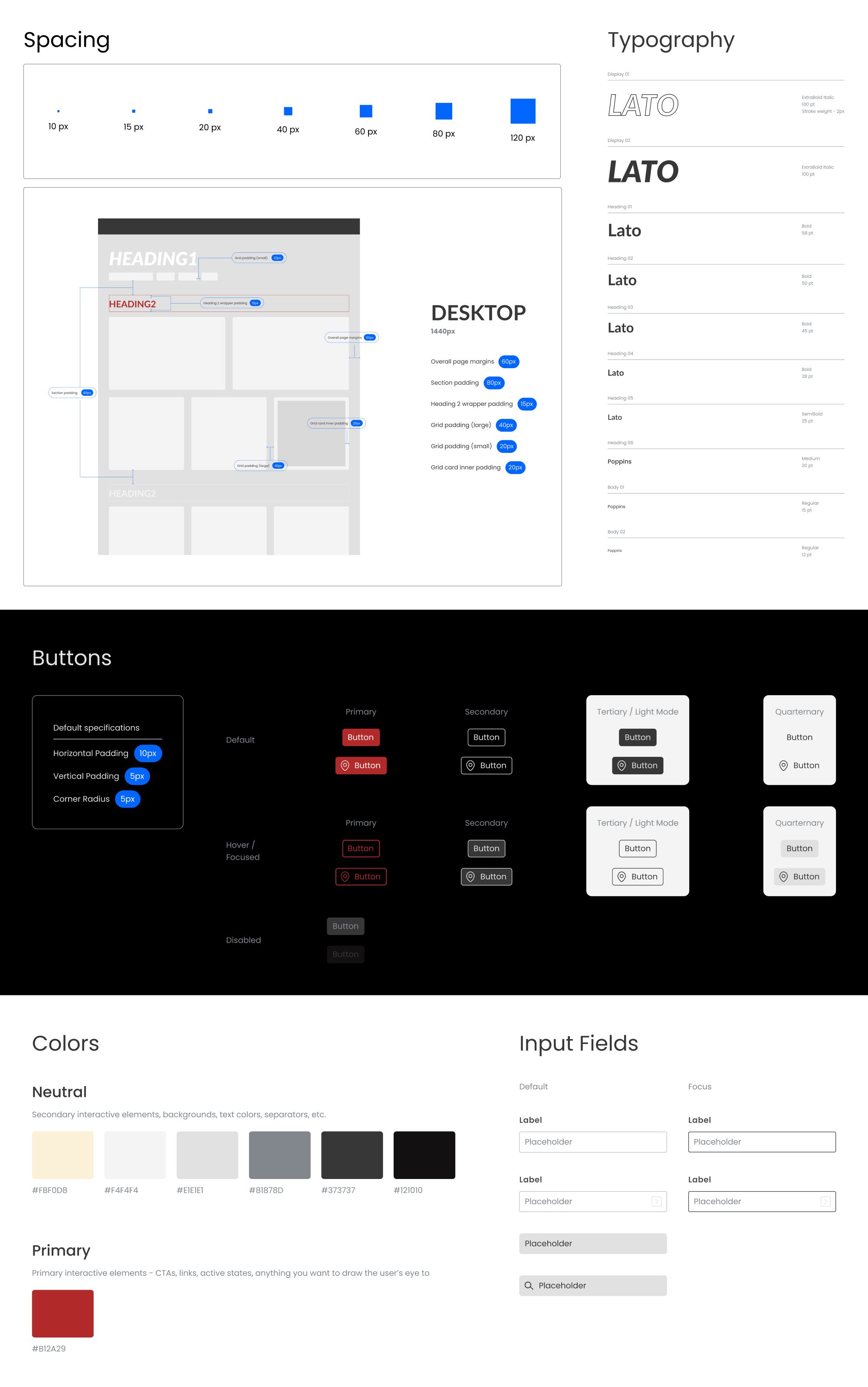
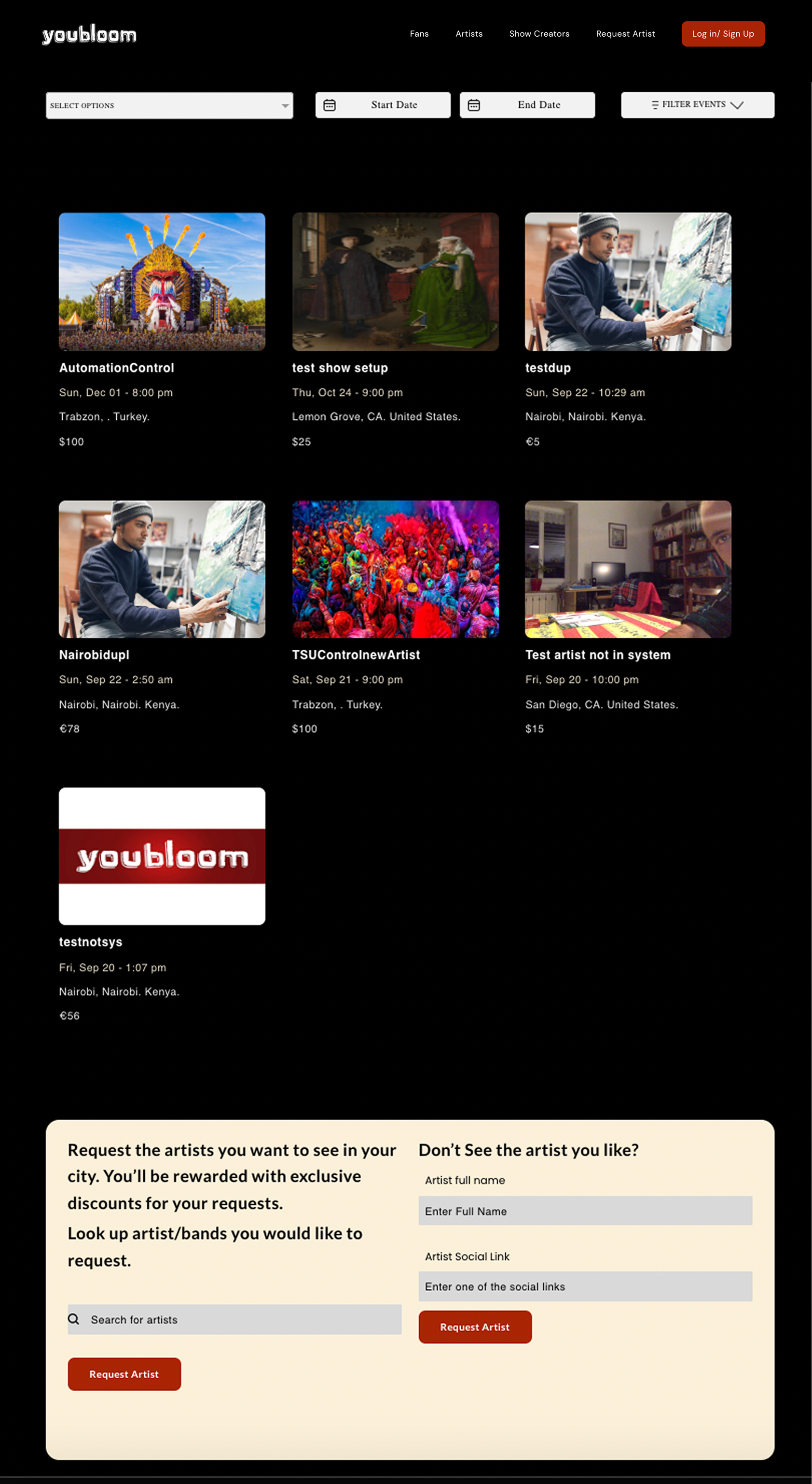
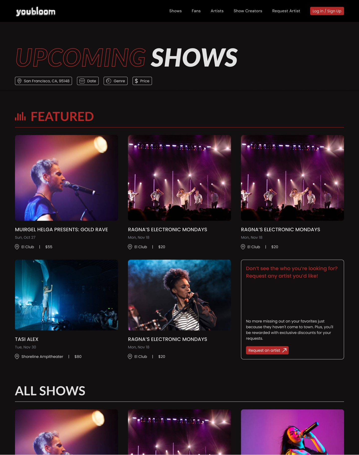
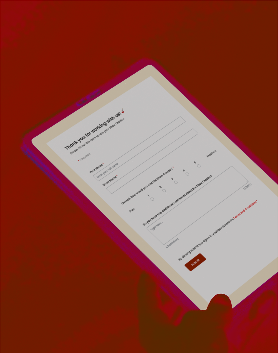
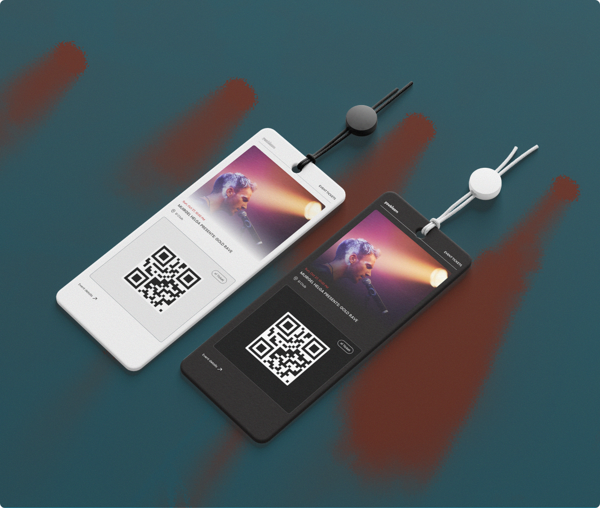
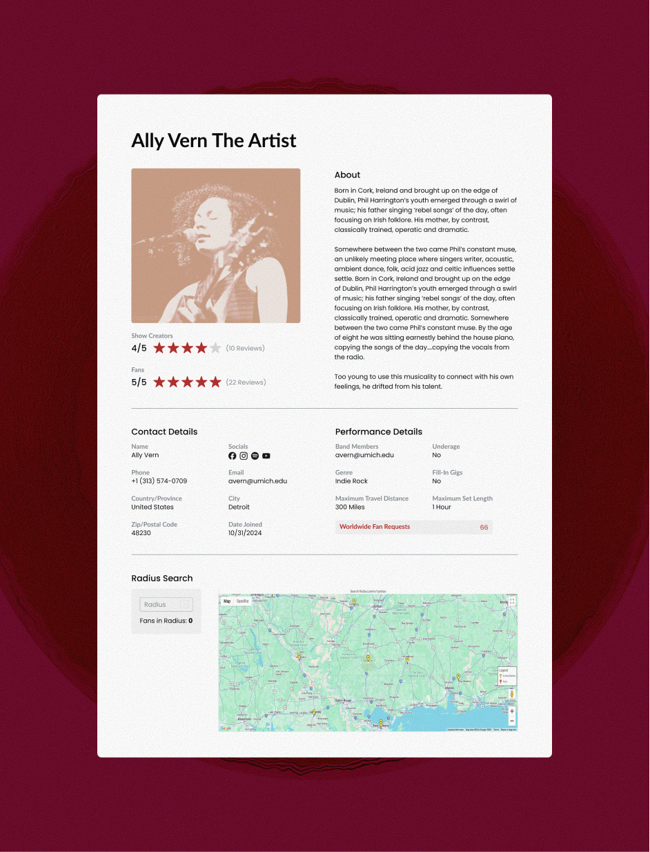
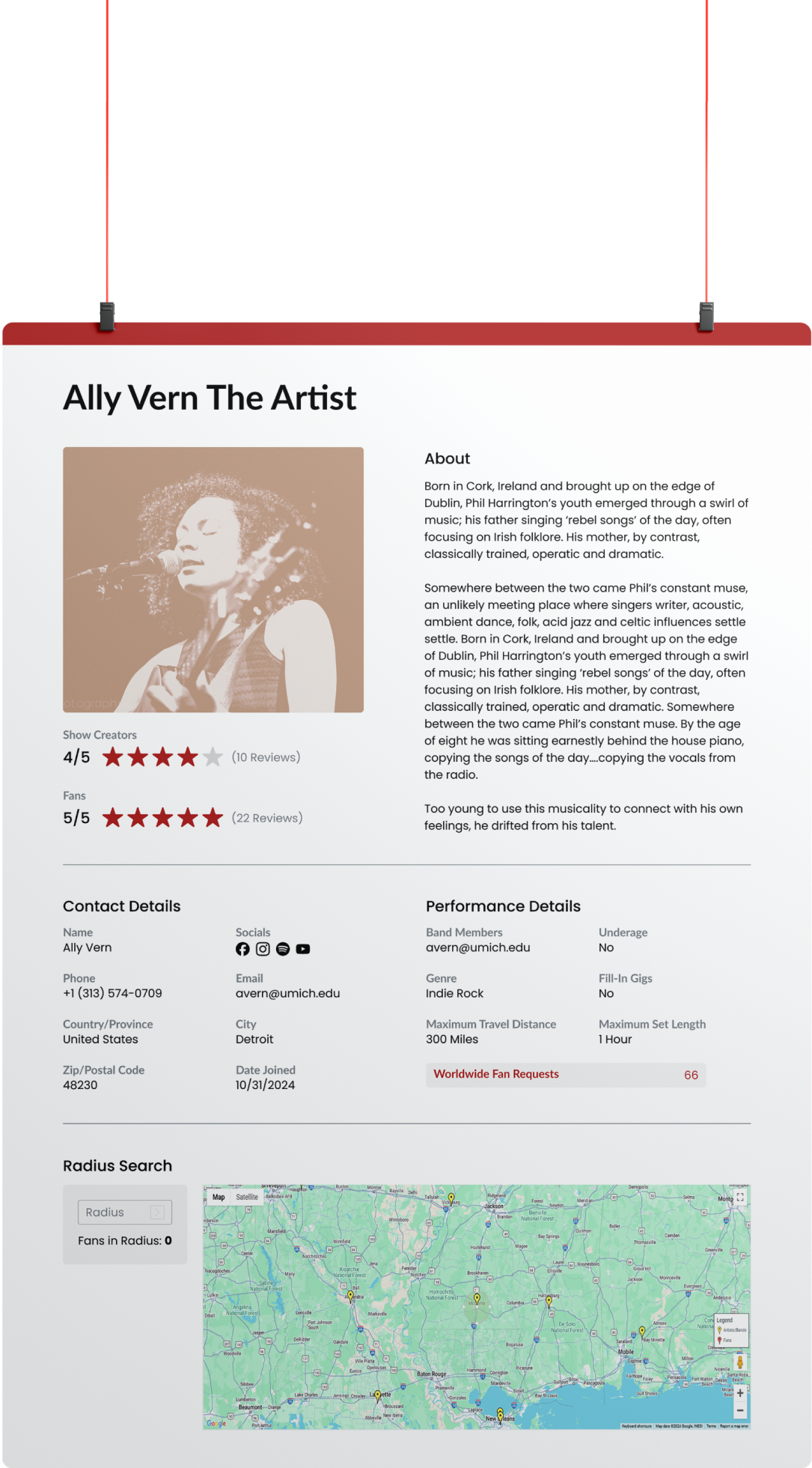
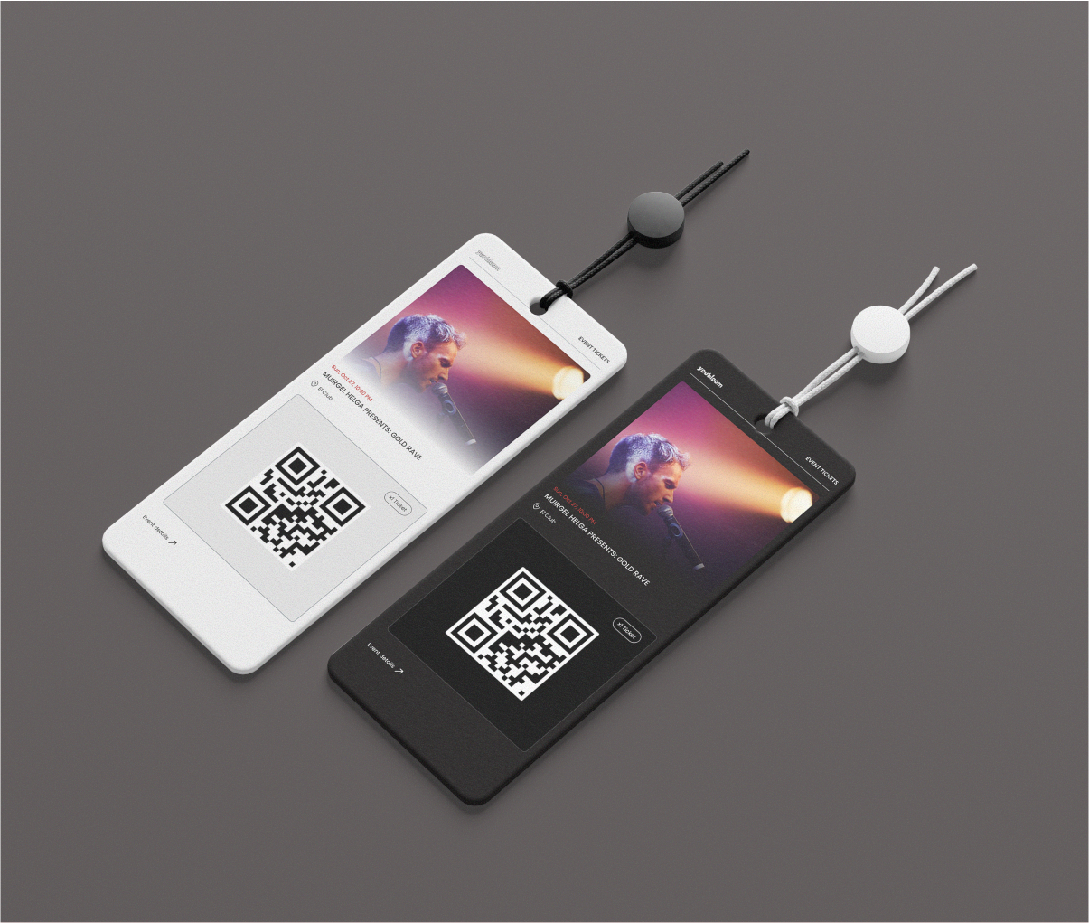
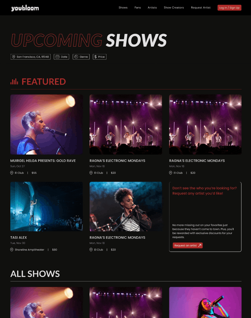
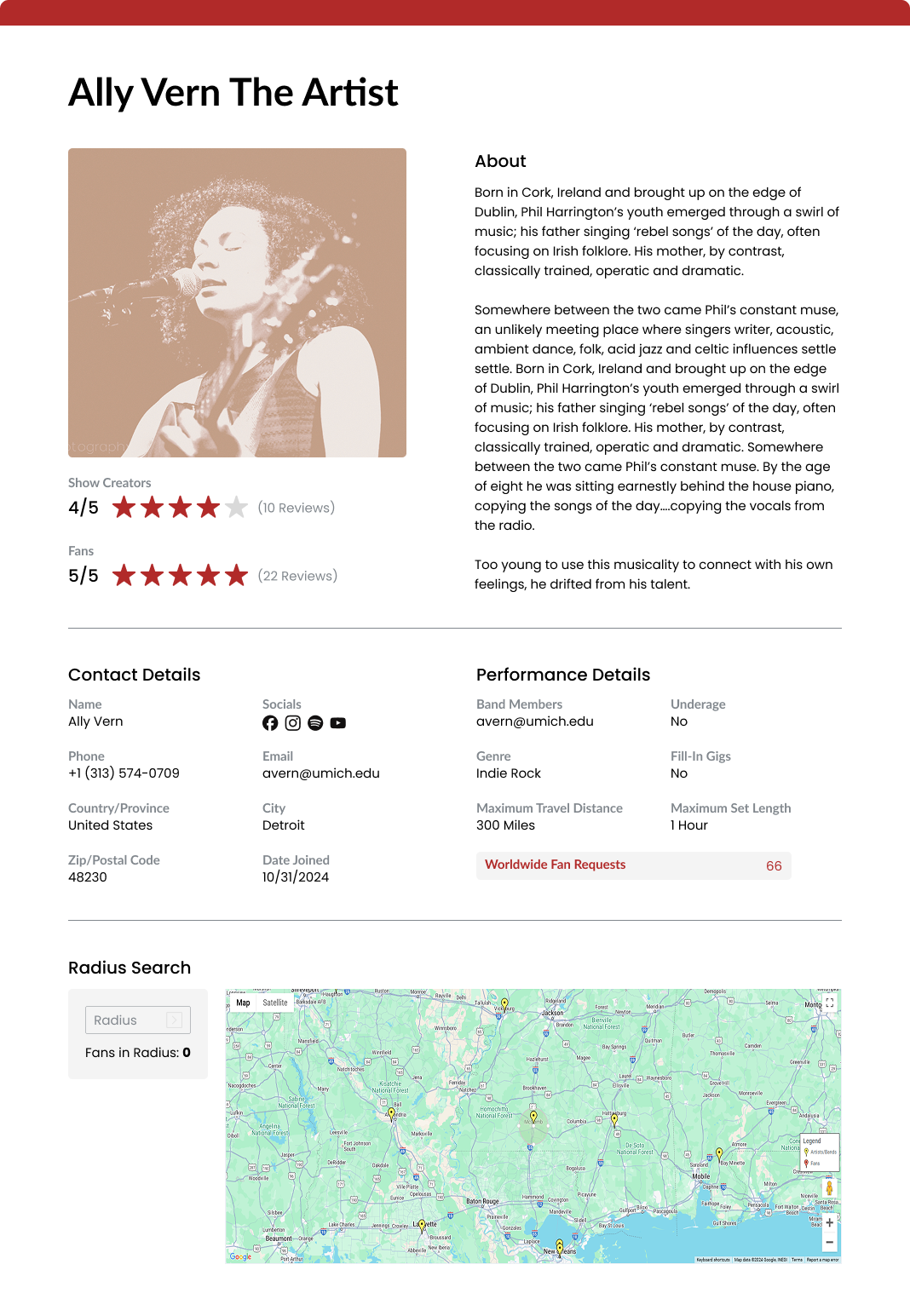
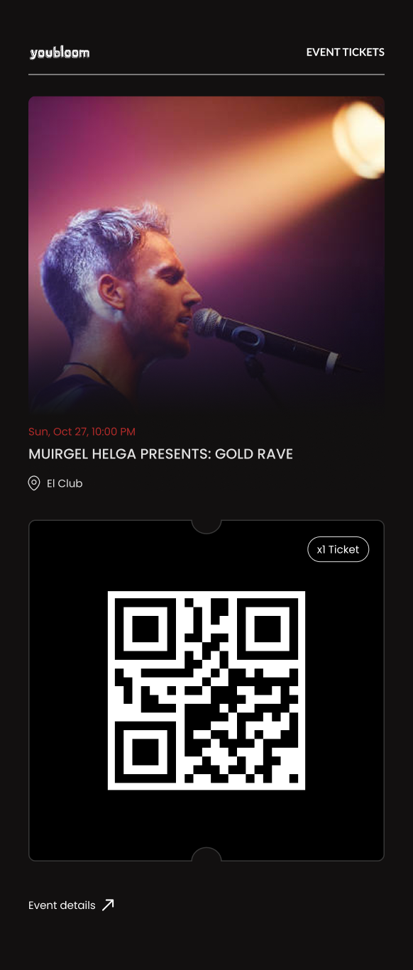
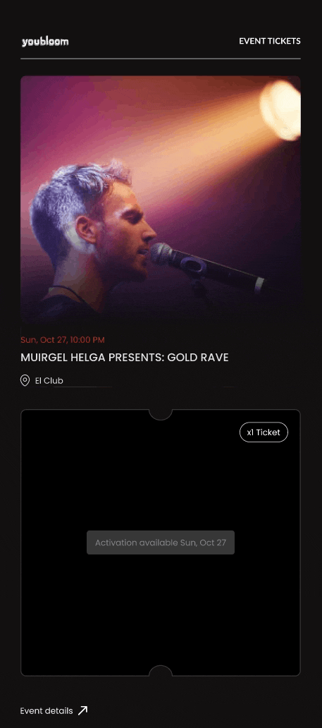
By creating a comprehensive design system, I ensured a cohesive look and feel across the platform, supporting youbloom's mission to connect show creators, artists, and fans for live event discovery and attendance.
I also worked with the development and business analysis team to fix UI bugs and spearhead new features.
I also worked with the development and business analysis team to fix UI bugs and spearhead new features.
JUMP TO FINAL PROTOTYPE
TEAM
Ally Vern
DURATION
3 months
TOOls
Figma
Wordpress
Wordpress
MY ROLE
UI Designer
UI/UX Bug Tester & Analyst
UI/UX Bug Tester & Analyst
WHAT IS COMMUNITY GEARBOX?
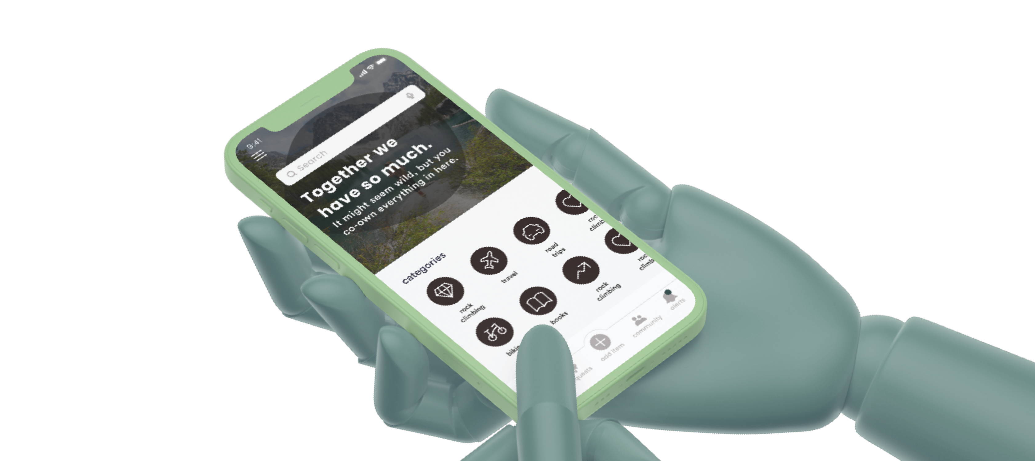
Community Gearbox is a social inventory platform that helps people share, co-own, and mobilize resources within trusted groups. However, despite great interest in the app, its current state suffered from engagement drop-offs and usability issues based on early pilot studies.
Our team set out to improve usability while making sharing feel more personal, rewarding, and rooted in trust.
Our team set out to improve usability while making sharing feel more personal, rewarding, and rooted in trust.
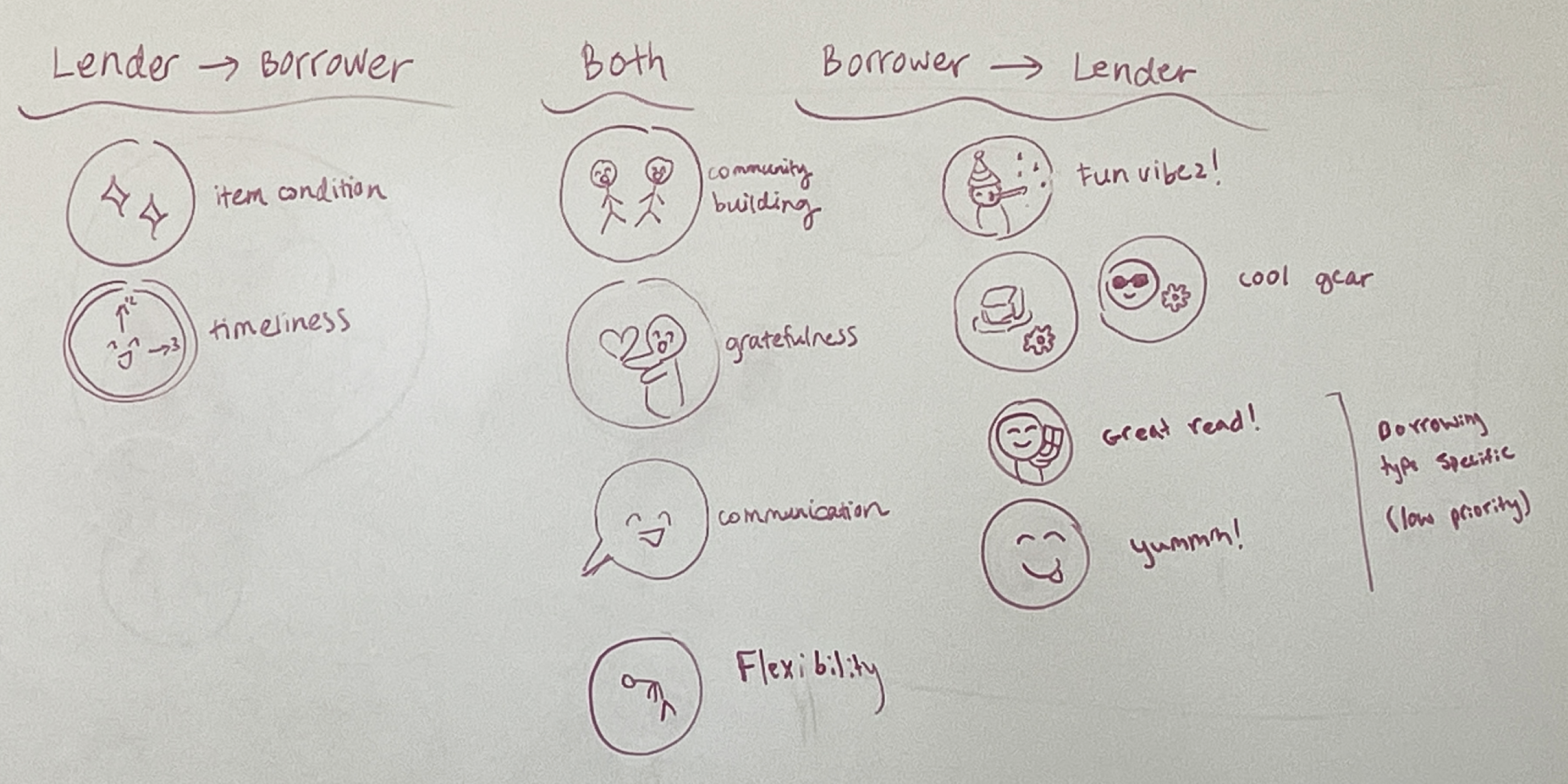
Understanding What Motivates People to Share
01
Sponsor Usability Test Review
We synthesized insights from earlier testing to identify known UI issues and gaps in usability.
02
DISCOVERY INTERVIEWS

We collaborated with our sponsor in conducting discovery interviews with the goals of understanding what types of sharing users are interested in and what encourages them to share.
03
OUR OWN user interviews
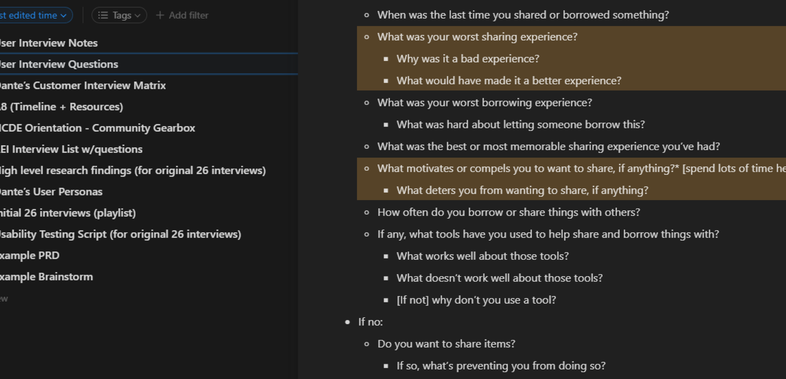
We conducted additional interviews with underrepresented users (ages 19–25) to learn what motivates them to share, how their trust can be earned by others within a community, and what makes an exchange feel positive.
After combing through the usability tests and completing both sets of interviews, we organized our research through affinity diagramming. By clustering related observations and quotes, we were able to identify the most urgent user needs that would inspire our key features.
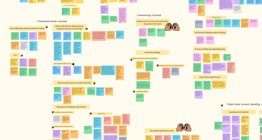
The categories and insights are as follows.
trust & motivation
- People are more motivated to lend when they understand the borrower’s story or why they need something
ui/usability issues
- Lack of visual consistency
- Confusing terminology and IA pathways
community building
- Users want to see items in action (like adventure photos)
- Engagement within the community affects how much sharing is happening.
Design Focus
01
How might we design peer-to-peer interactions to make lenders feel appreciated and comfortable when sharing?
02
How might we simplify navigation and clarify the posting/borrowing experience?
Transforming Pain Points to Opportunity
I created user journey maps to align the team on workflow breakdowns and identify joyful moments we could amplify.
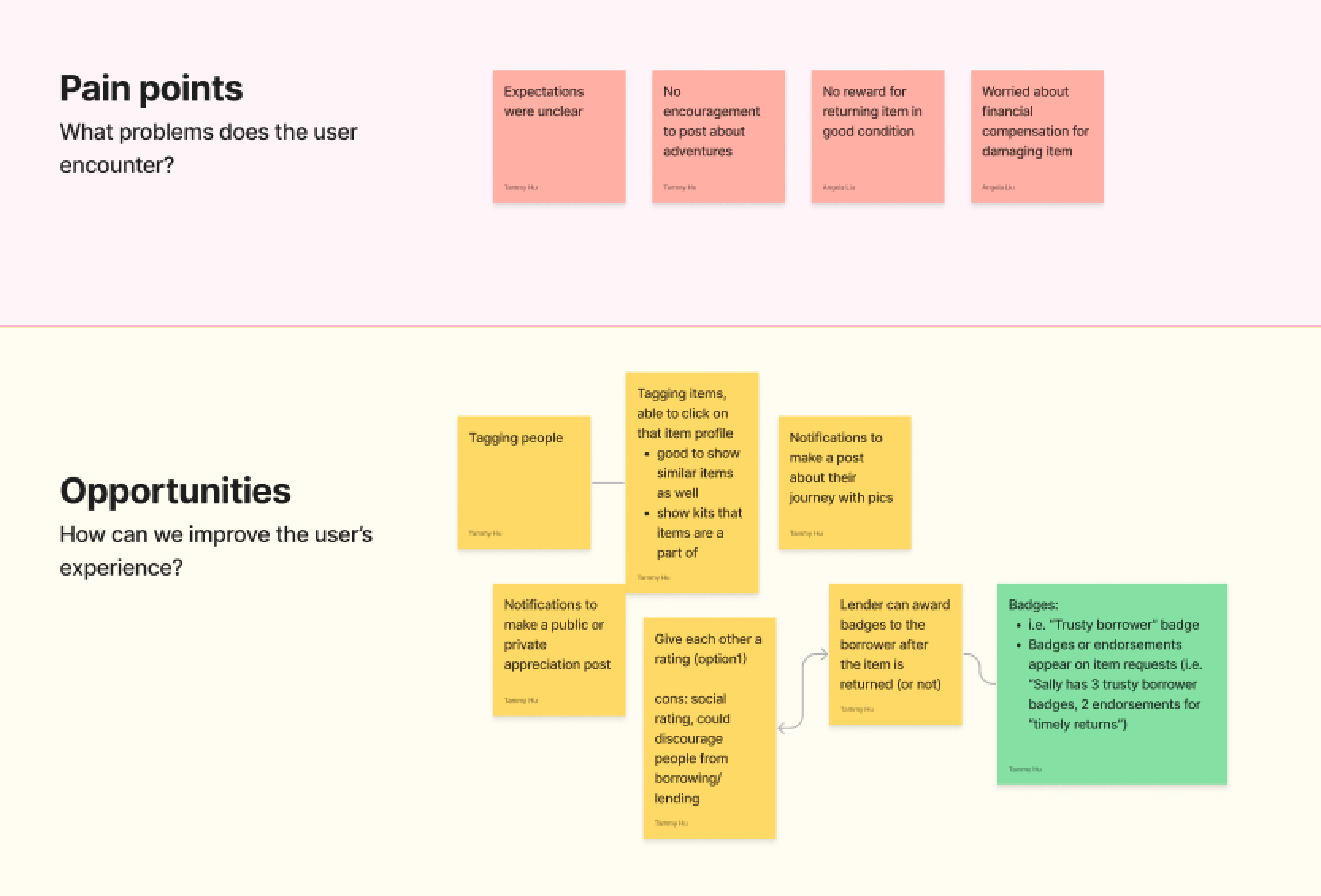
One major opportunity — increase delight and trust in the exchange experience.
This led to the creation of a badge system: a friendly alternative to a traditional rating system that avoids hierarchy while recognizing good borrowing behavior. It also served as the first micro-interaction that made sharing fun.
This led to the creation of a badge system: a friendly alternative to a traditional rating system that avoids hierarchy while recognizing good borrowing behavior. It also served as the first micro-interaction that made sharing fun.
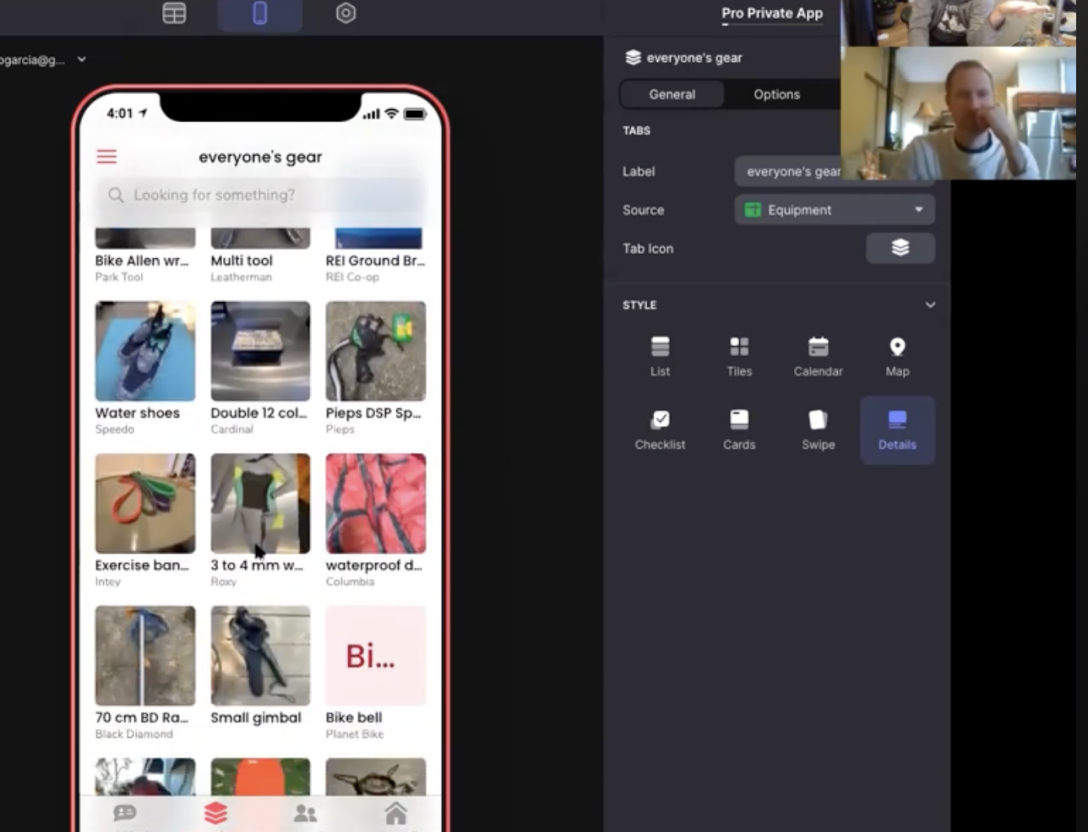
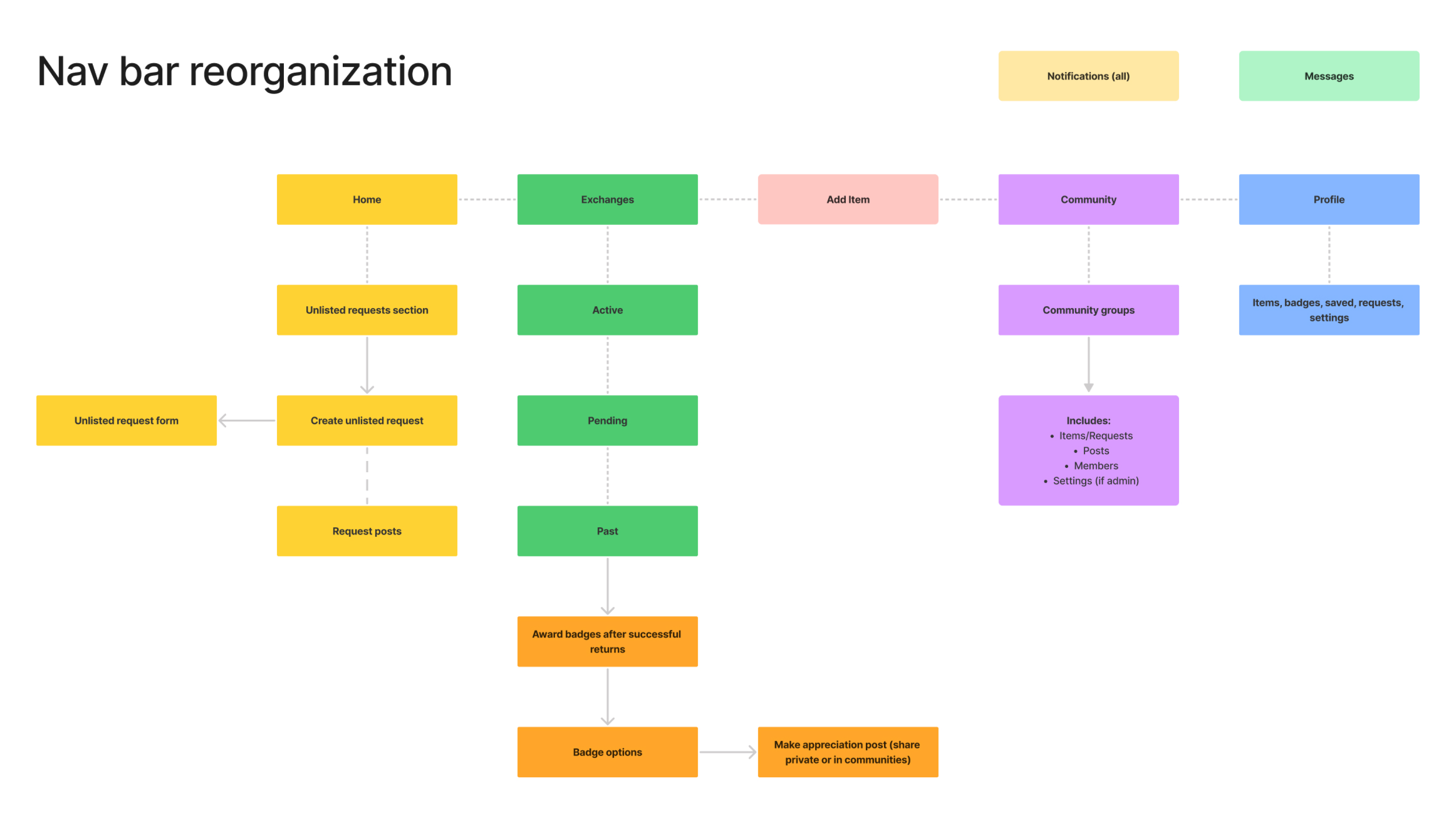
Structuring the Platform for Clarity
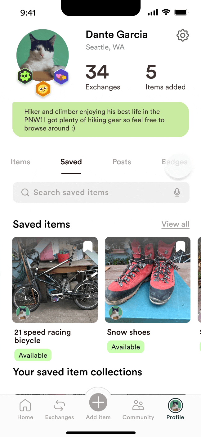
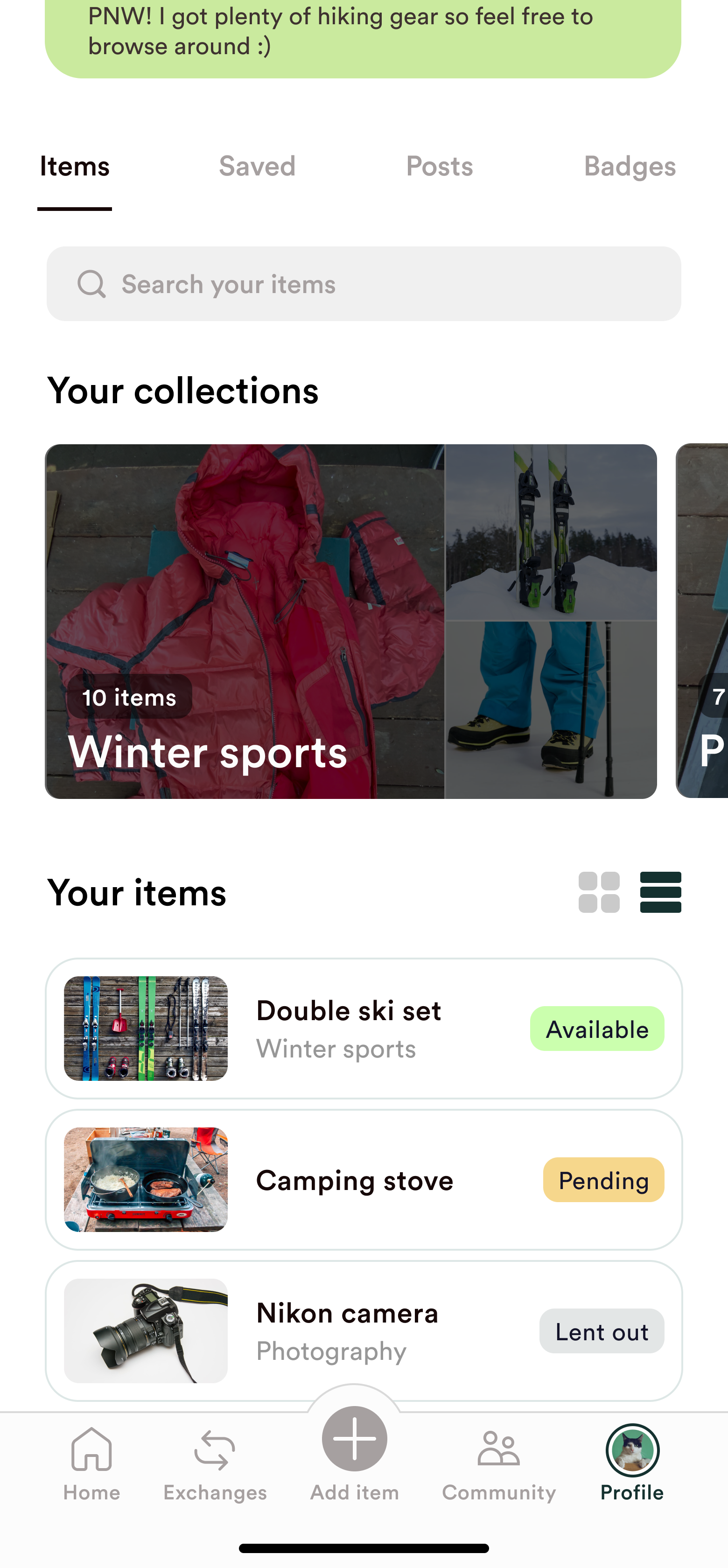
To resolve confusion in navigation, we redesigned the app’s information architecture.I led restructuring of the Profile tab, simplifying pathways to:
- Items shared
- Saved items
- Community activity
- Earned badges
This provided a more intuitive mental model for how users navigated their own items and information.
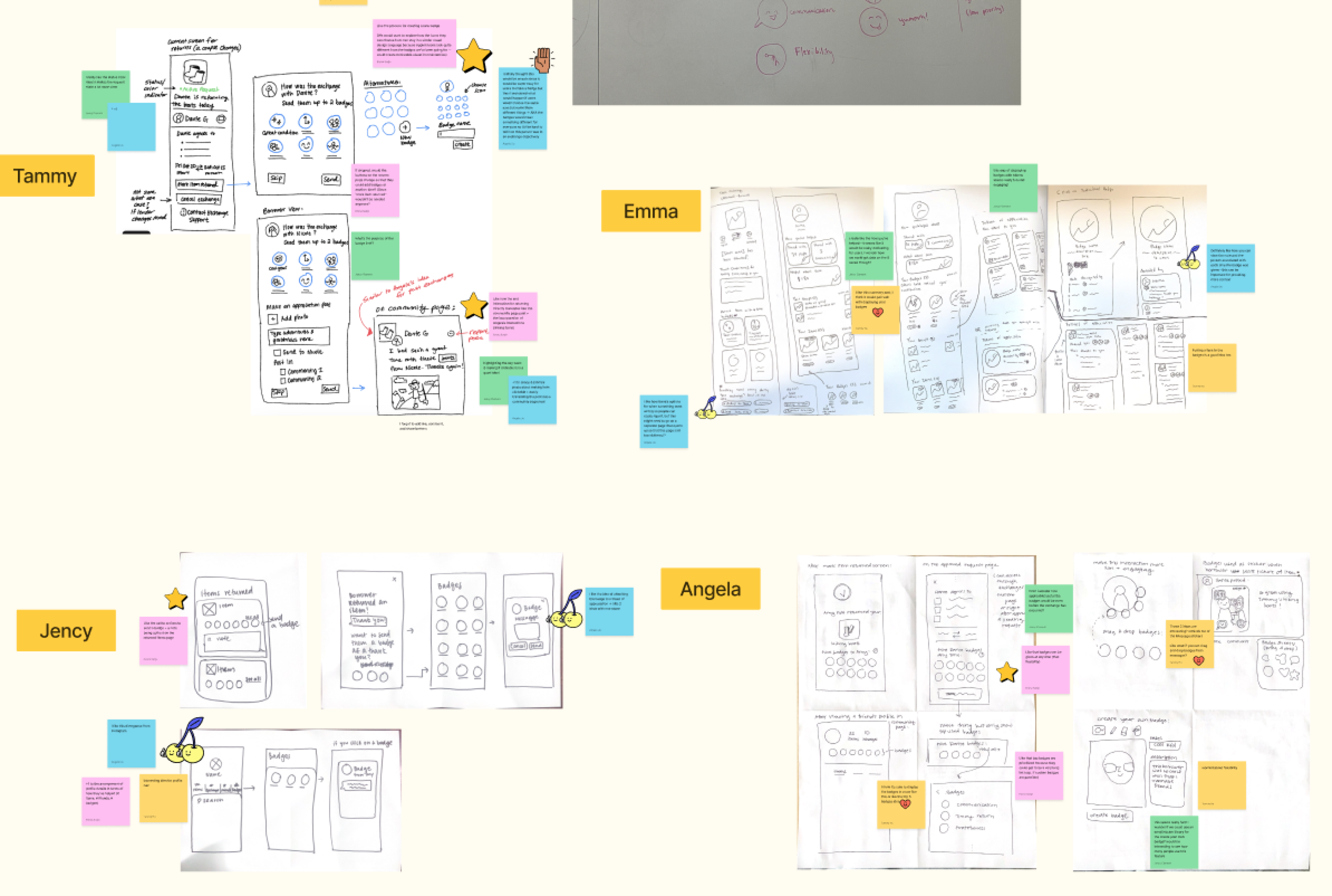
Sketching to Explore the Opportunity Space
We kicked off ideation with Crazy 8s to rapidly generate multiple concepts for key features and user flows. After each round, we shared and critiqued our ideas in FigJam — noting promising designs, evaluating feasibility, and double-checking that they aligned directly with our user needs.
During this phase, I also led initial sketches of the badge system to explore what badges feel rewarding and informative to give out.
During this phase, I also led initial sketches of the badge system to explore what badges feel rewarding and informative to give out.
MID-FIDELITY PROTOTYPE
Here are summaries of the features I worked on.
01
badges
.png)
.png)
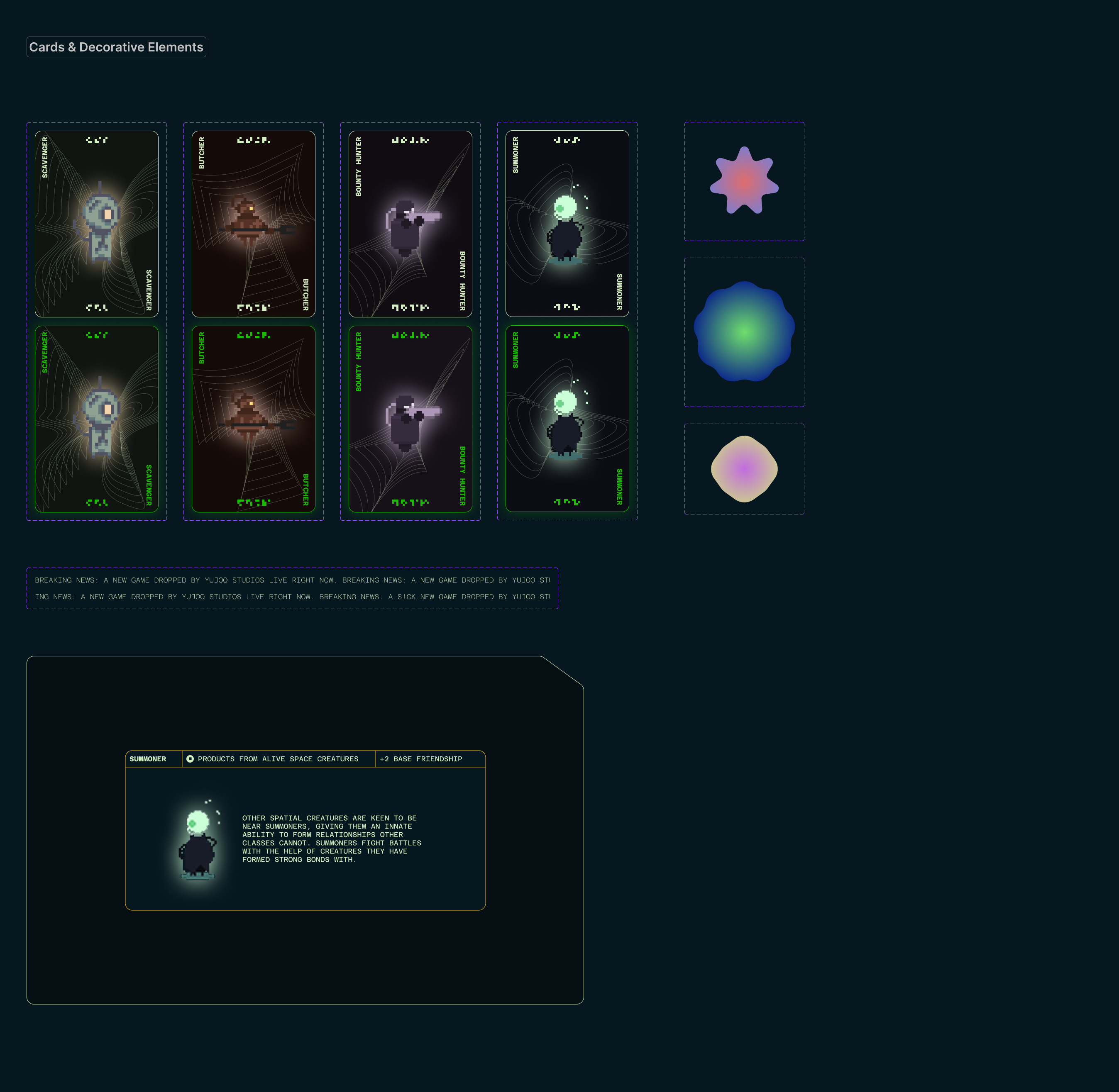
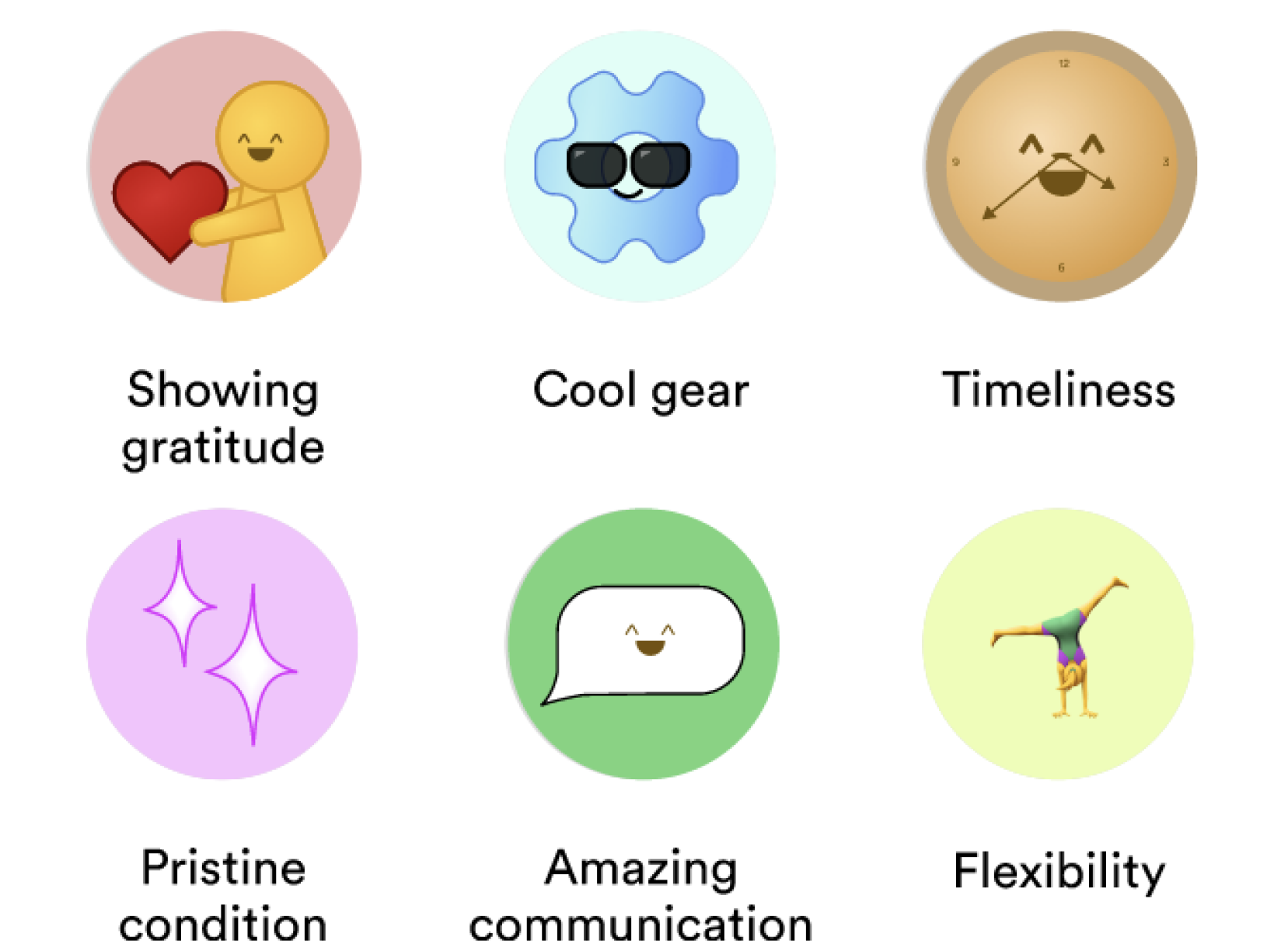
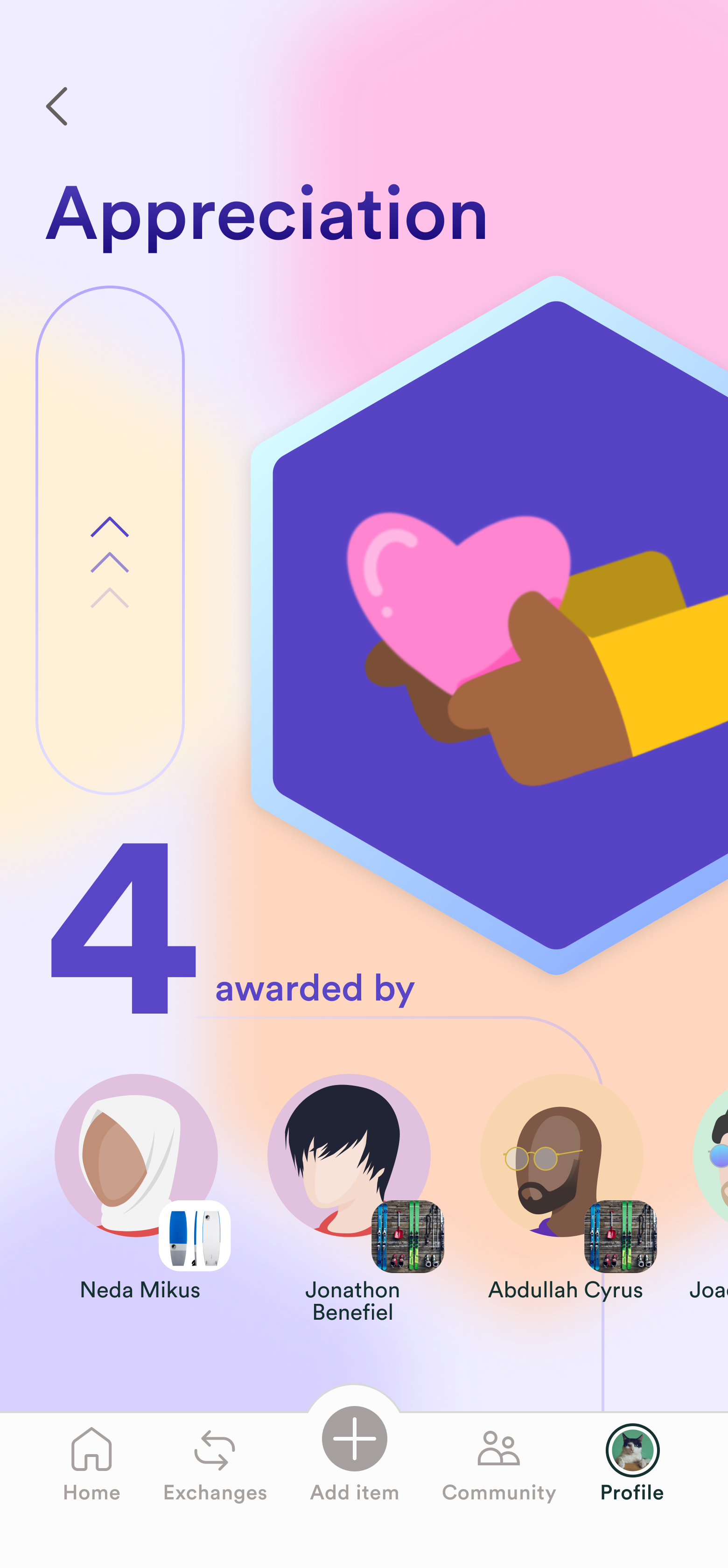
The badge system acts in place of a rating system to establish greater trust without creating an unhealthy social hierarchy.
These are a few of the mid-fi iterations of badge ideas. I chose these labels based on the research insights of what users consider to be bad vs. good lending, as well as what motivates users to share their items with others. For instance, because users were worried that their items would be damaged in an exchange, we included the badge of “pristine condition” as an indicator of a borrower returning the item in great condition.
02
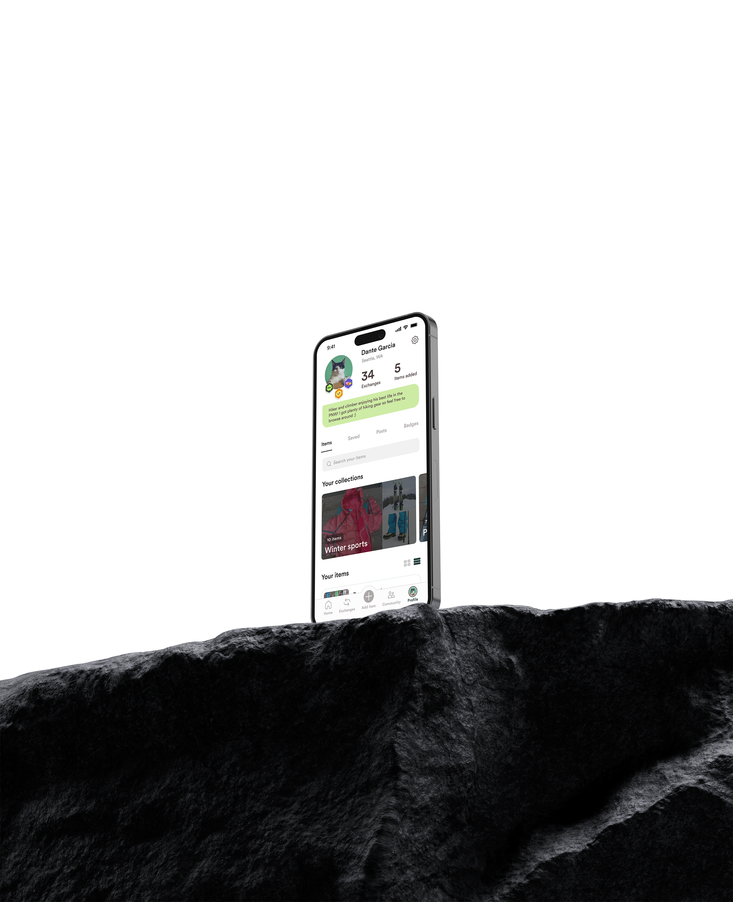
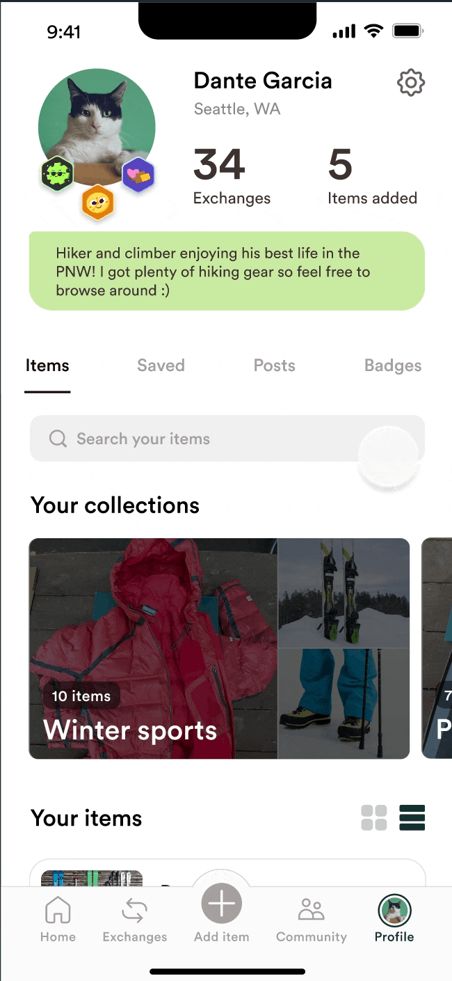
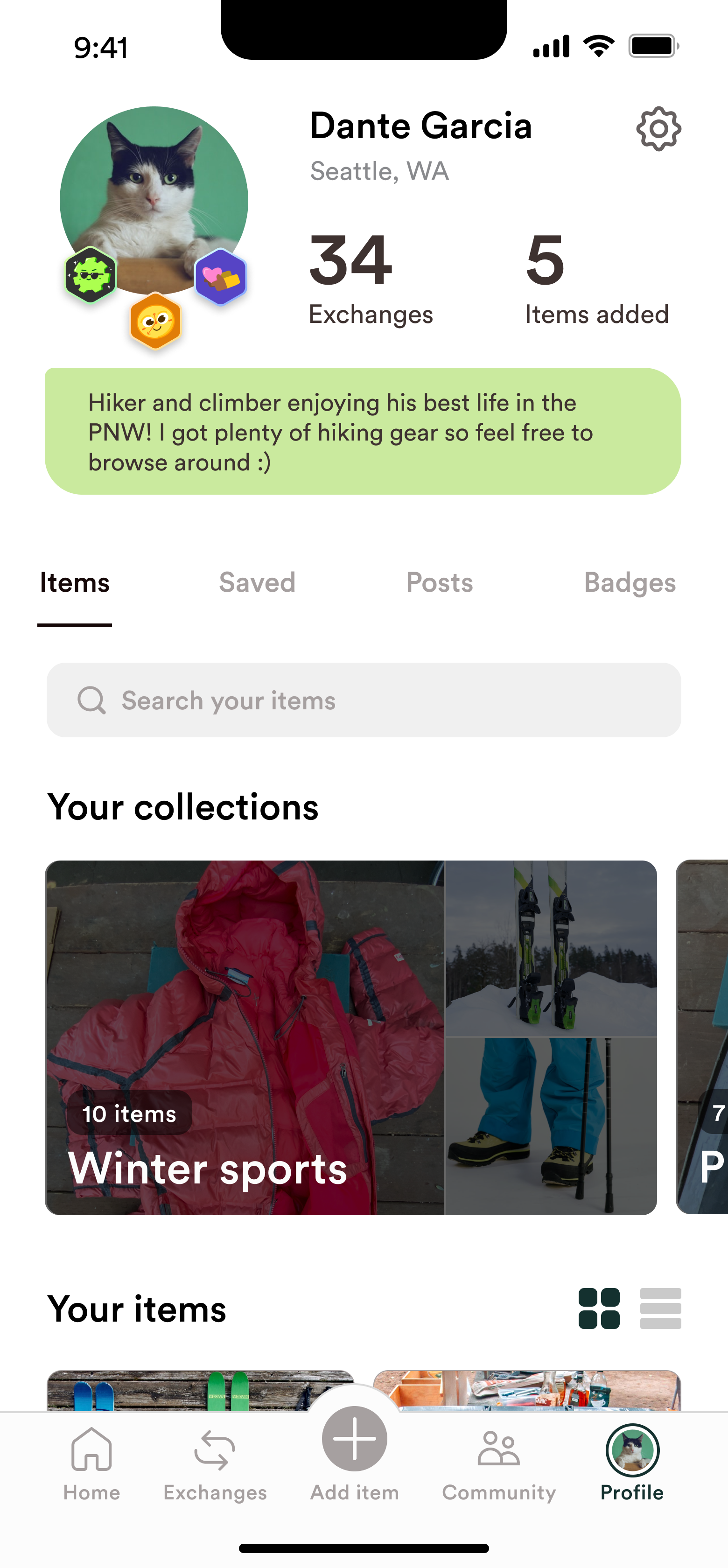
PROFILE PAGE
.png)
Profile IA - Before
.png)
Profile IA - After
I redesigned the profile page to contain a submenu that has tabs established by the restructured IA.
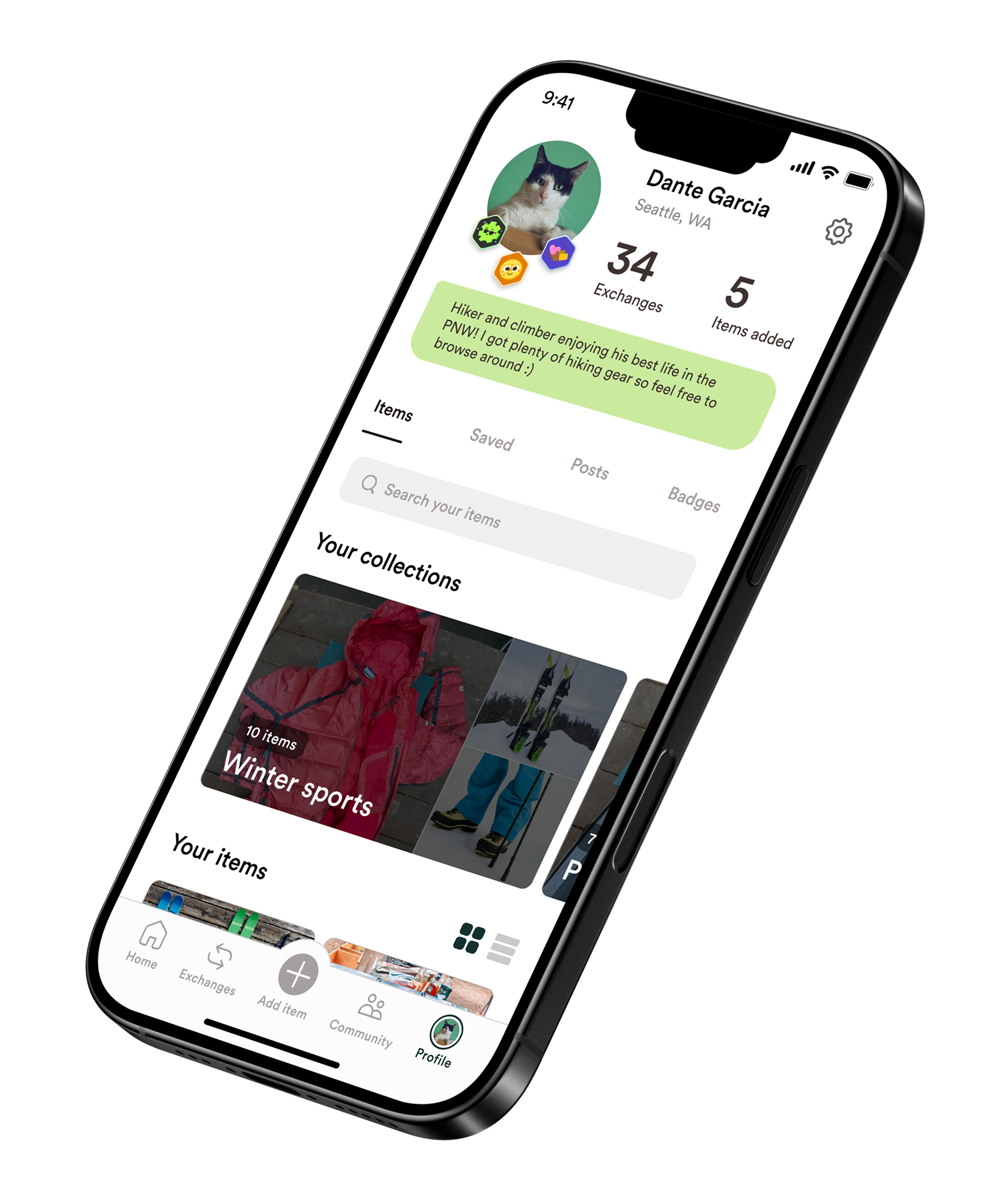
I visually highlighted badges using the Gearbox “gear” shape for personality and recognizability.
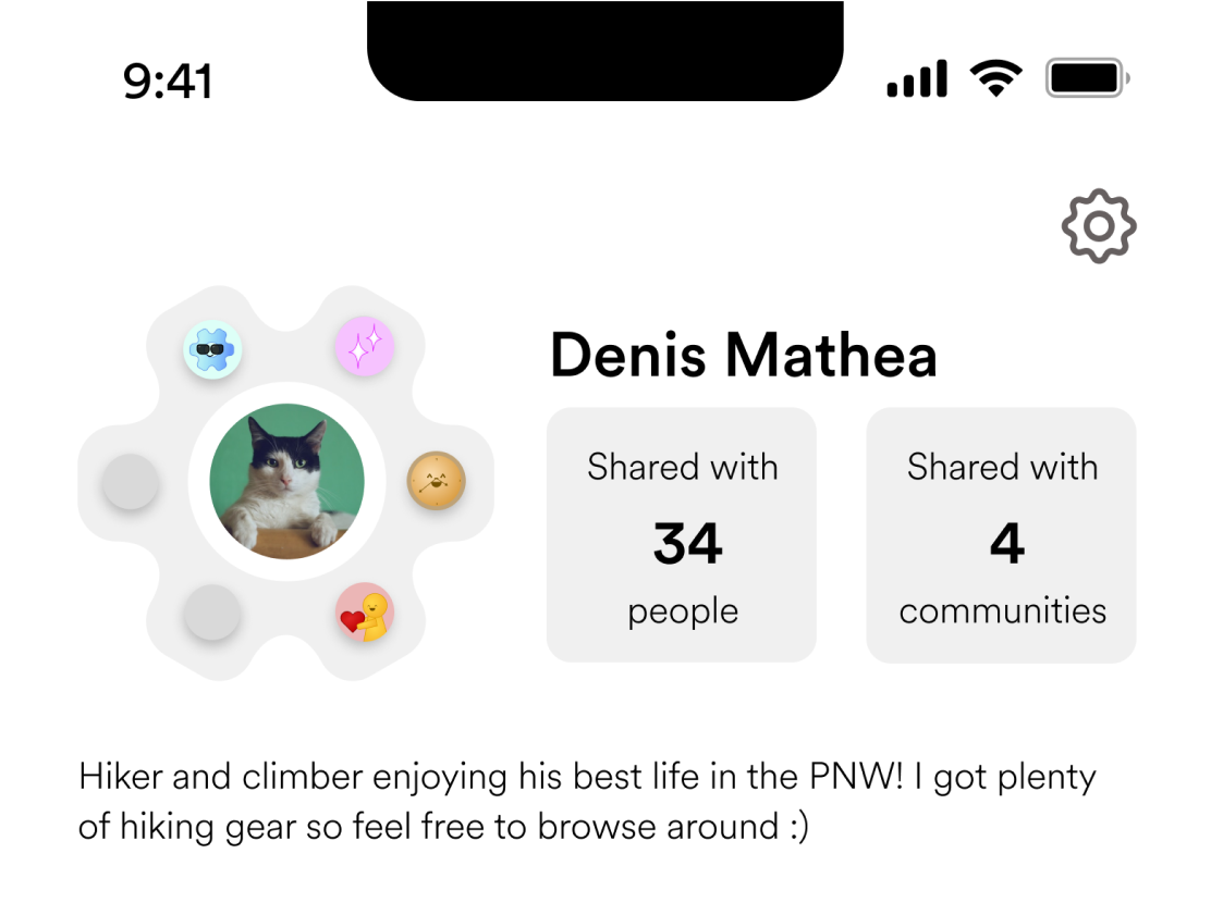
I added meaningful usage stats and sharing activity.
03
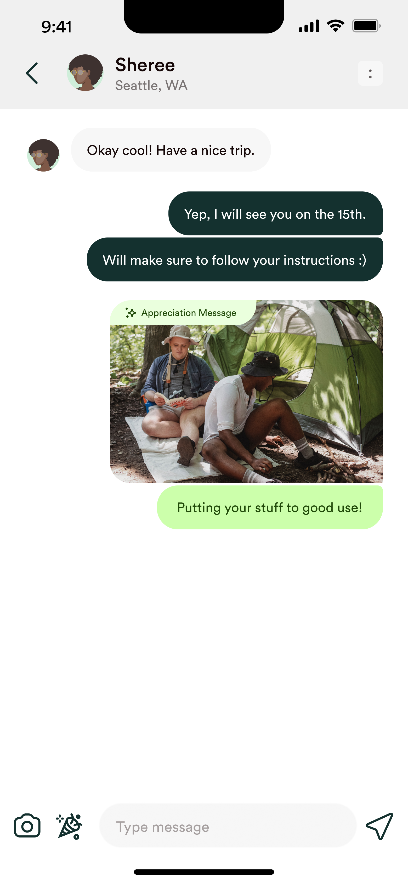
THANK YOU MESSAGE
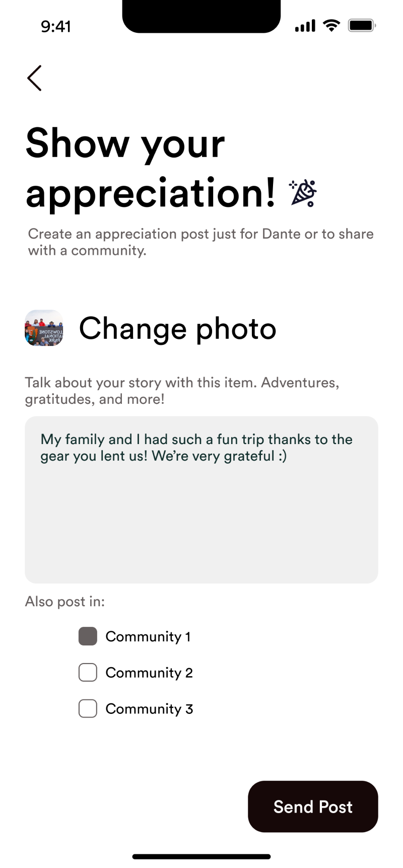
Users wanted to see how their items were used. So, we introduced a way for borrowers to share a quick message or photo to show how they used a borrowed item. This small conversation moment deepens trust — and can spark future sharing.
usability testing
We ran usability tests with 15 tasks across core flows. We evaluated:
- Ease of completing key tasks
- Hierarchy and clarity of content
- Perceived usefulness of added features
Here are our main findings:
01
Some profile statistics lacked meaning
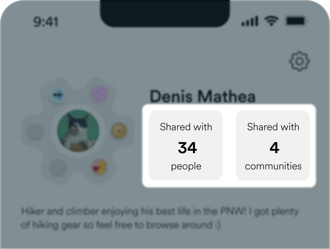
Users were unsure if the "Shared with __ people" and "Shared with __ communities" statistics were valuable, I iterated to highlight more impactful personal insights.
02
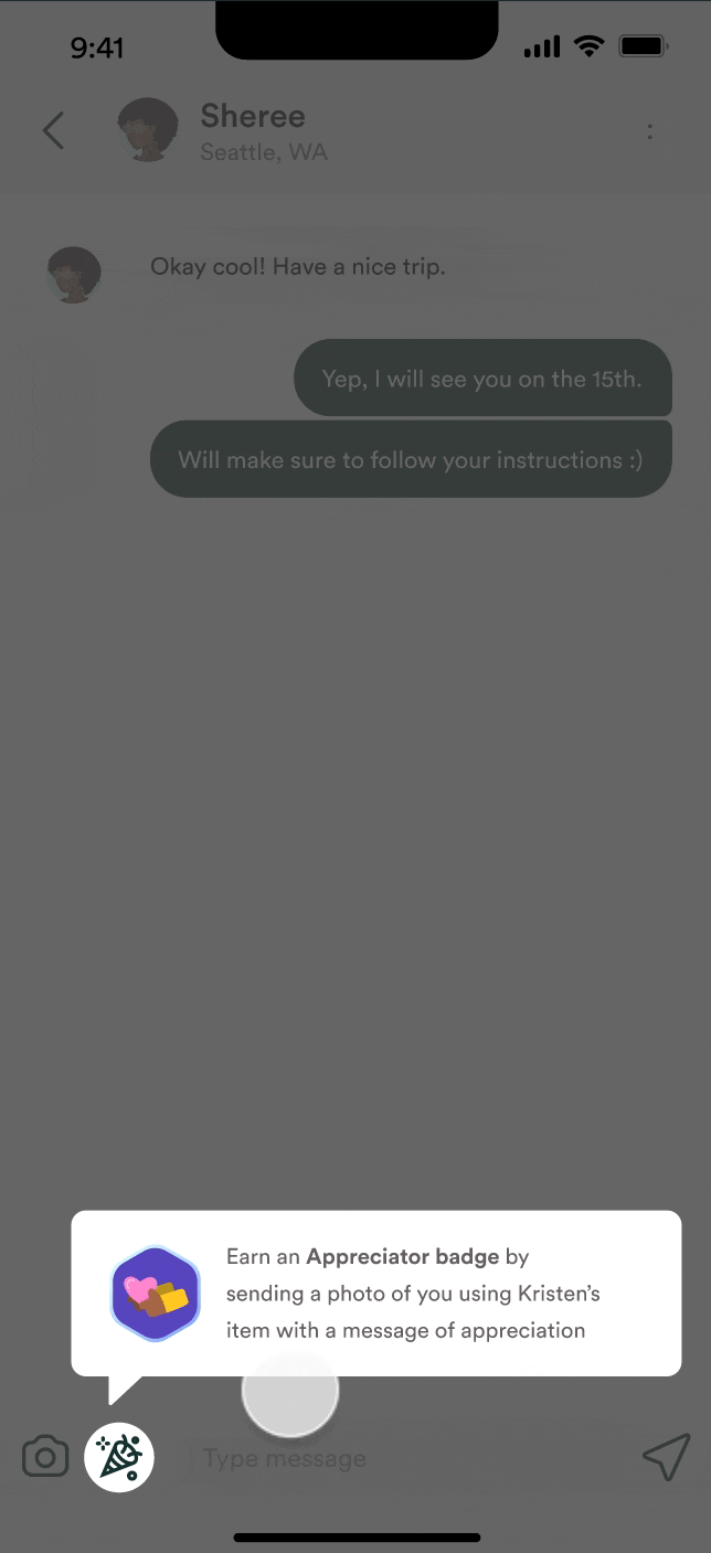
Participants felt that there were too many required actions post-exchange.
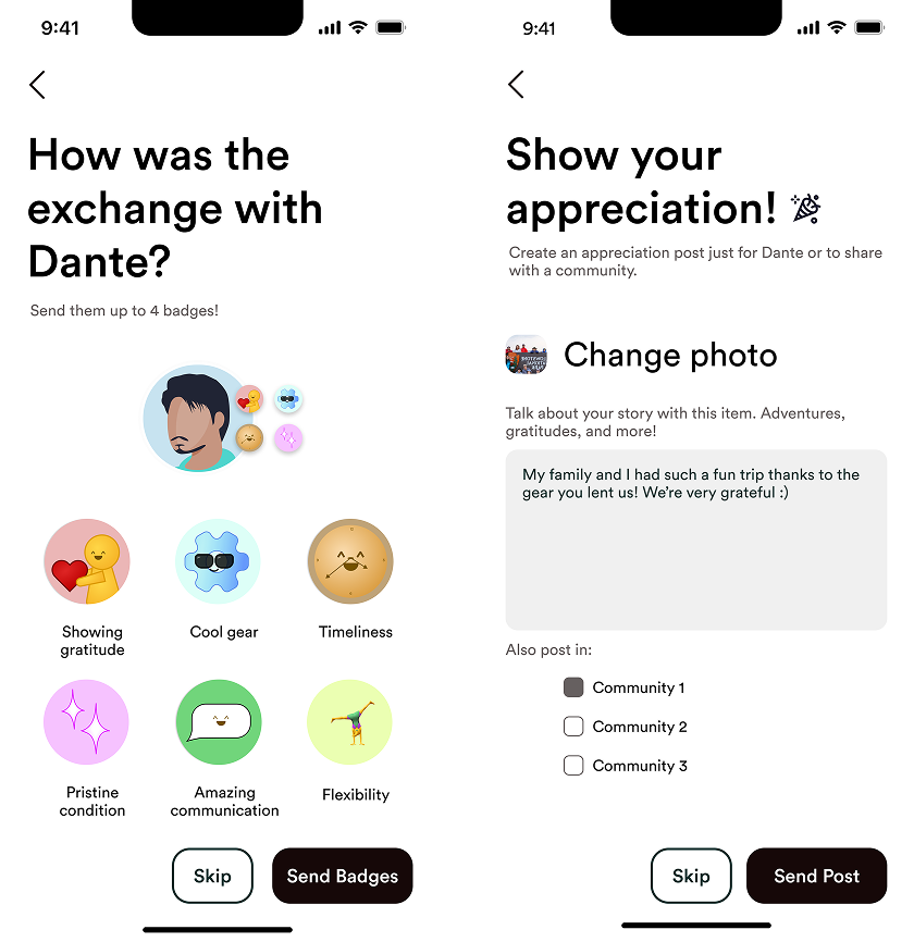
Users liked badges or messages — not both every time. I made giving badges and appreciation messages optional by adding a skip button.
In our final prototype, I ended up re-adjusting the appreciation message flow to appear during the exchange flow instead of after and integrated it into the message tab to make it feel unobtrusive. This adjustment increased both motivation and simplicity.
In our final prototype, I ended up re-adjusting the appreciation message flow to appear during the exchange flow instead of after and integrated it into the message tab to make it feel unobtrusive. This adjustment increased both motivation and simplicity.
Final Prototype
BADGES
BEFORE
/
AFTER
This is some text inside of a div block.
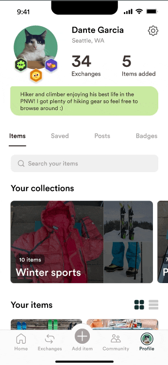
PROFILE (USER ITEMS)
BEFORE
/
AFTER
PROFILE (APPRECIATION MESSAGE)
BEFORE
/
AFTER
PROFILE (HEADER)
BEFORE
/
AFTER
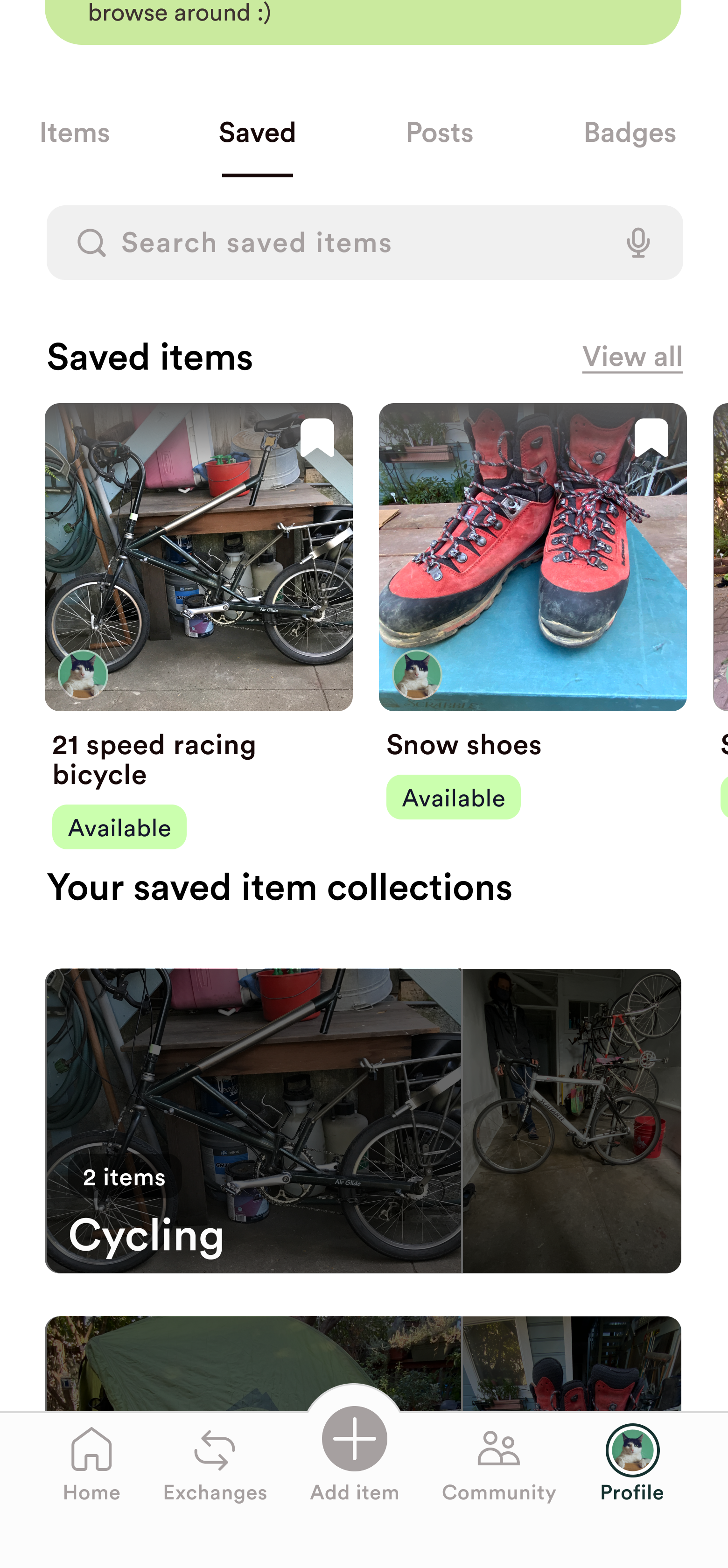
PROFILE (SAVED ITEMS)
BEFORE
/
AFTER
BADGES
BEFORE
/
AFTER
PROFILE (USER ITEMS)
BEFORE
/
AFTER
PROFILE (APPRECIATION MESSAGE)
BEFORE
/
AFTER
PROFILE (HEADER)
BEFORE
/
AFTER
PROFILE (SAVED ITEMS)
BEFORE
/
AFTER
BADGE EXCHANGE
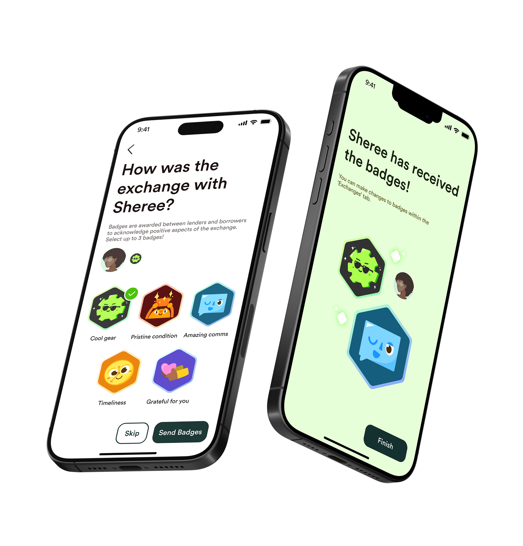
Updated the design style of the badge system pages to match our new design system. A skip button was added to give users more control and make the process feel optional.
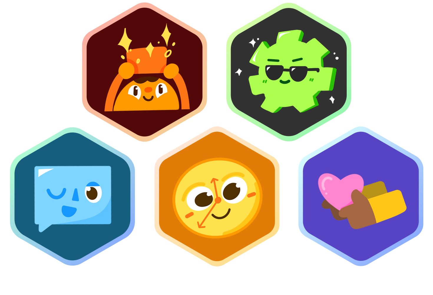
BADGE ILLUSTRATIONS
These are the revamped the badge illustrations and badge exchange screens to be cohesive with the new brand and language - approachable and fun.
PROFILE - ITEMS & SAVED TABS
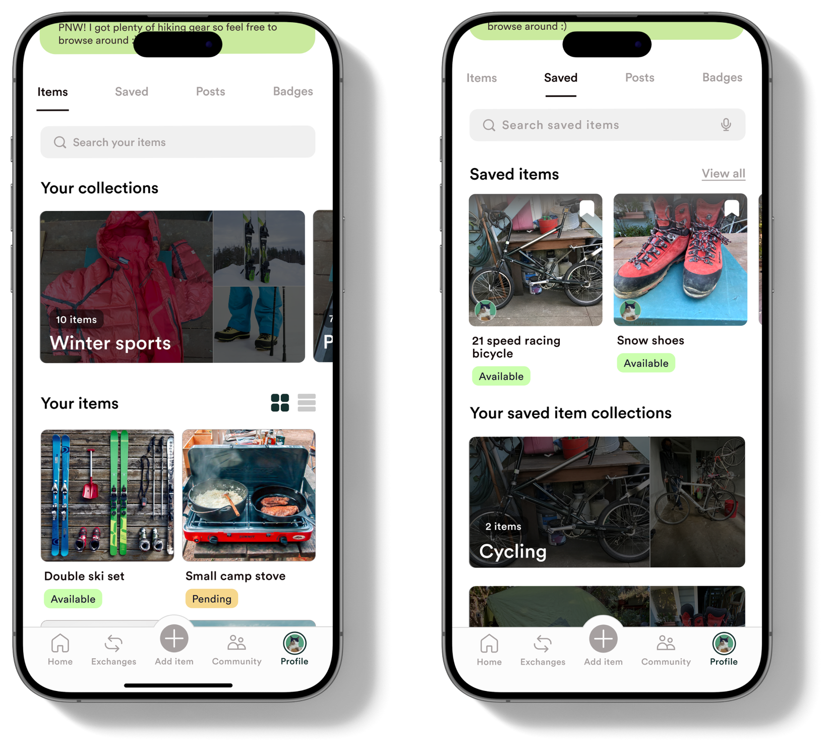
Differentiated look of ‘Saved’ tab from ‘Items’ tab so users can easily know which tab they are looking at.
PROFILE - BADGES TAB
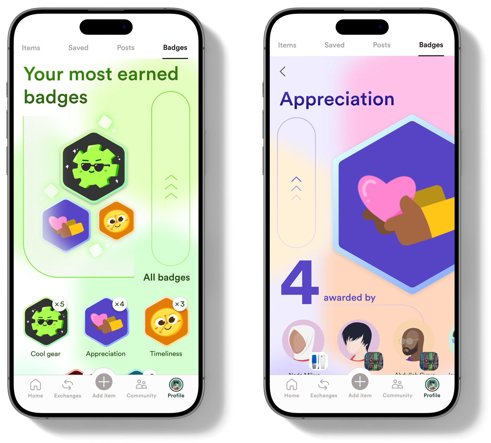
Updated the visual design of the ‘Badges’ tab to be more engaging and match our current style.
PROFILE - ITEMS & SAVED TABS
Changed the arrangement of profile picture and badge icons to be more clear and concise.
APPRECIATION MESSAGE
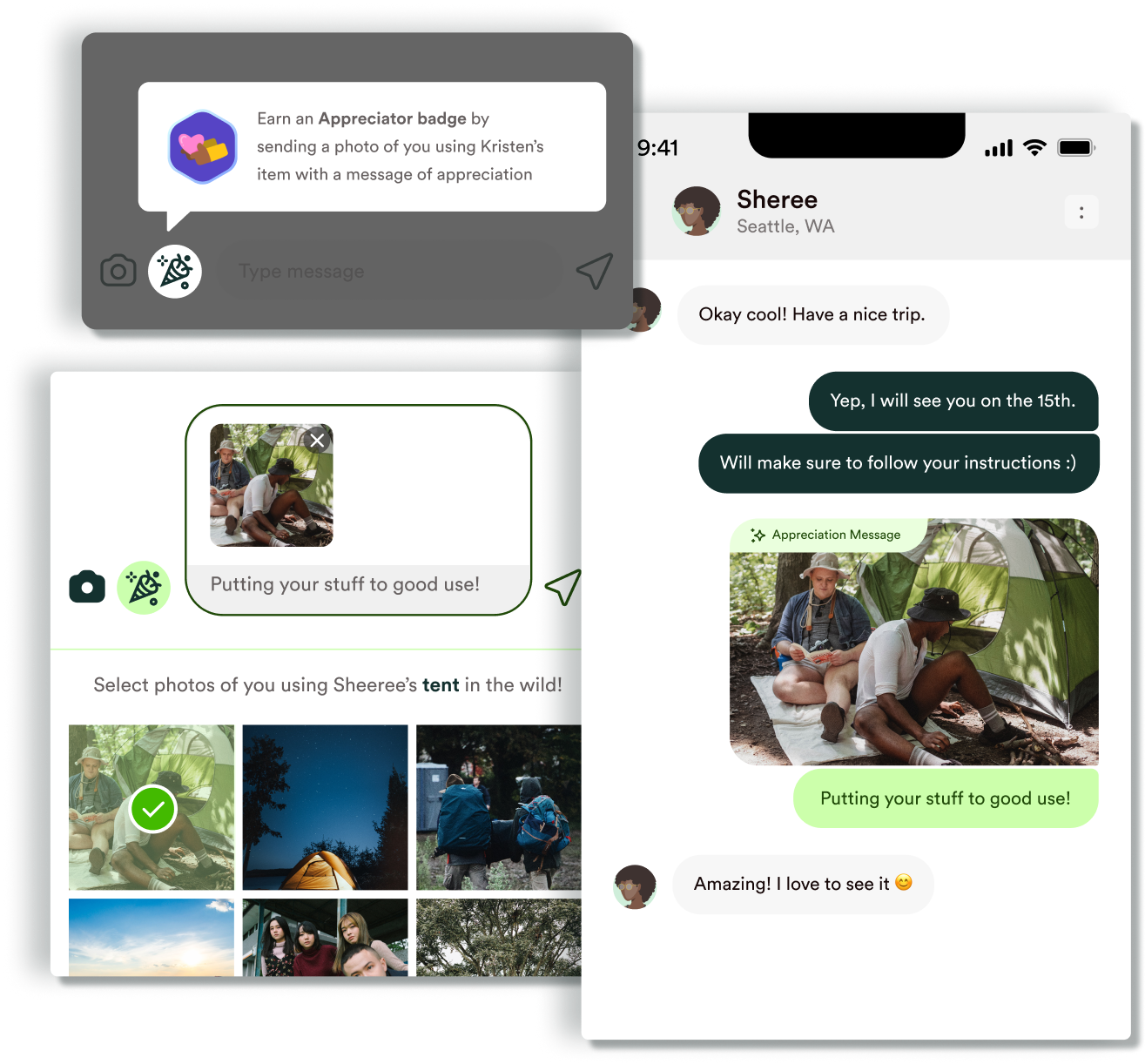
Integrated appreciation messages directly into chats, allowing users to highlight any message as an appreciation instead of sending a regular text.
PERSONAL TAKEAWAYS
Being able to work on this project was really a once-in-a-lifetime experience. I learned a lot from my sponsor and was deeply inspired by the way my teammates think and work.
A key challenge in this project was exploring an industry that was completely new to me. I enjoyed learning how lending supports community, especially in outdoor spaces where gear is expensive and inclusion is important. Through user conversations, I learned that people want to feel helpful and appreciated. That insight guided prototype features like appreciation messages and badges, and reinforced how meaningful small, thoughtful interactions can be.
A key challenge in this project was exploring an industry that was completely new to me. I enjoyed learning how lending supports community, especially in outdoor spaces where gear is expensive and inclusion is important. Through user conversations, I learned that people want to feel helpful and appreciated. That insight guided prototype features like appreciation messages and badges, and reinforced how meaningful small, thoughtful interactions can be.